I love old family photos – I use them a lot on my memoir blog, The King of Isabelle Avenue. I think they are fun to look at and they give me a chance to add some ridiculous captions. Recently Val from The Arty Old Bird contacted me about colorizing (or should I say colourizing) a few of my vintage shots.
As someone who has worked professionally in photoshop since 1992, I’m beyond impressed. Being a “get it in camera” kind of photographer, I take a “light touch” approach to editing. I see people take it too far all the time, sacrificing detail or tone for a perceived improvement that blasts out the color or borders on looking fake. Val uses color richly but shows great restraint, and that’s the true artistry, knowing when to stop. It’s pretty amazing to see these images with color – I hadn’t really imagined that they would be so profoundly different. I feel like I’m getting a window into the world long since past.
The first shot is my great great grandpa Pyeatte, he’s holding my grandmother as a toddler. I think it’s pretty interesting to see snapshots from this era, shots that are less formal than the family lined up in their Sunday best. I have always loved this shot, Grandma was very close to her grandfather, he was someone who told her she was special. I’m quite certain that I have him to thank for the amazing grandmother I had. The Ozark cabin in the background looks just like the ones I see on hillsides around my home.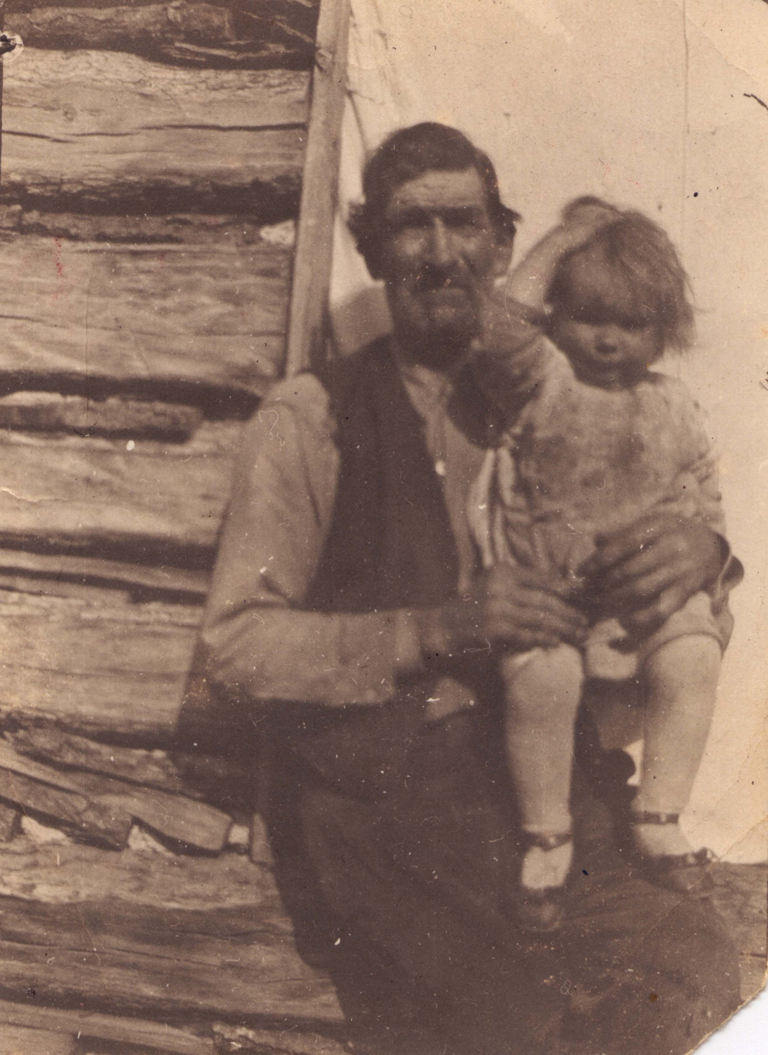
The colour in this version is more of a tinting, it warms and defines the image. I like how Val respects the original image and takes the colour far enough to improve it, but not so far that it loses authenticity.

This is a shot of me and my brothers, I’m guessing it’s very early in 1967. It was taken at my grandparent’s home and I was apparently not very happy with the situation. I’m certain it is because I worried that Ronnie would be taking “my room” since this was a constant worry for me at Grandma’s house. It could also be that Ronnie was a bit fussier than Max and that made me less comfortable around him at first.
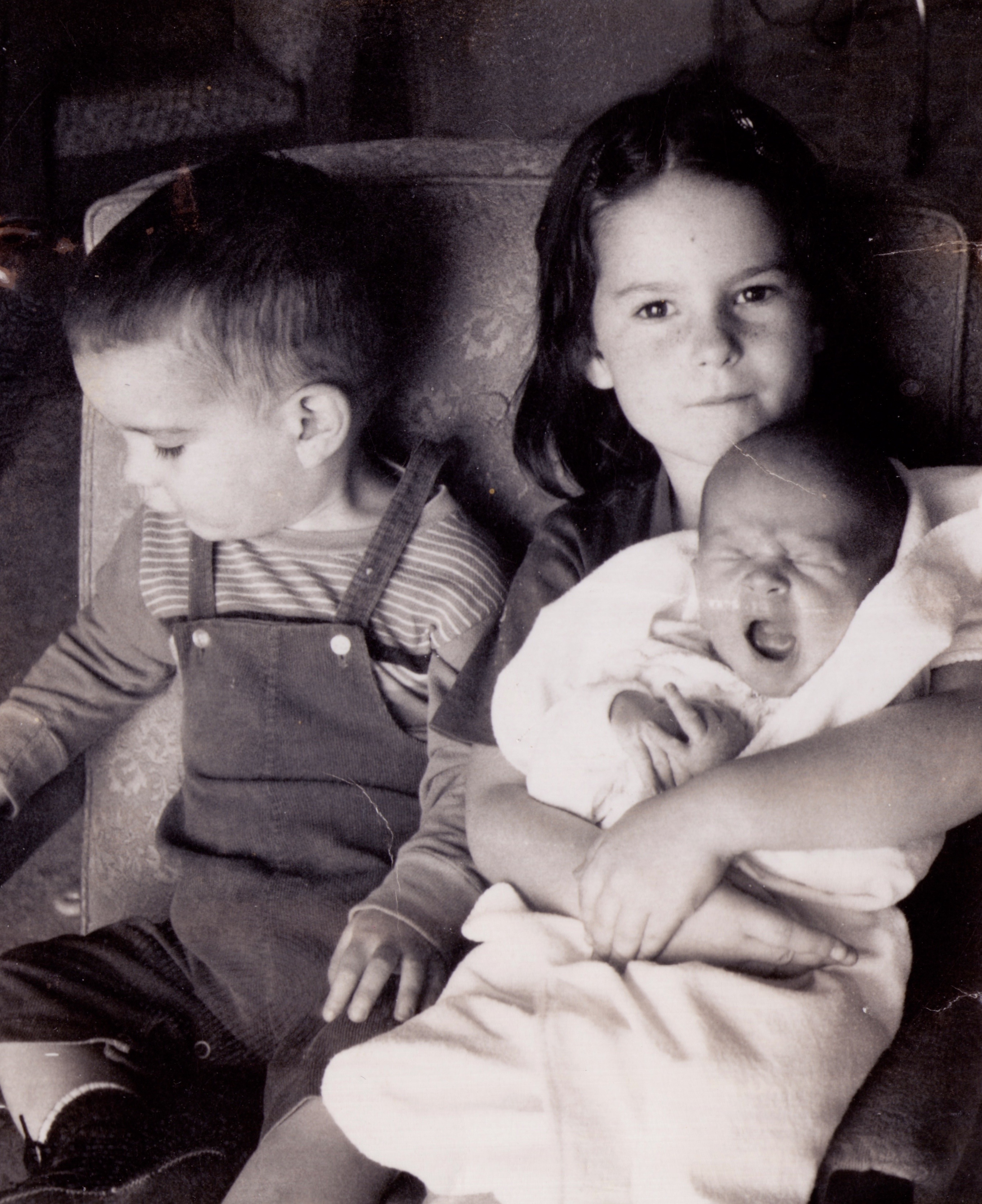 Max was the baby that all the neighborhood girls like to play house with because he was so laid back. I had imagined a baby doll to play with and Ronnie was just not that baby. He was an adorable baby, but oh so loud when he was not happy.
 Val made all the color decisions on this and came remarkably close to the actual colors of our outfits. This was a simple Polaroid and Val’s touch has made it so much more than it was.
I love this photo – it’s my Grandma in her Helldorado Emblem Club drill team costume. She was playing giddy-up with the local constable who had just locked Grandpa away in the city jail for shaving his beard – Circa 1948. Helldorado Days is an old Las Vegas celebration that began in 1934 – by 1946 it was so popular that Roy Rogers made a movie about it. I actually rode in the Helldorado parade many times as a kid – it’s a multigenerational tradition.
 What Val has done to this image is nothing short of amazing. The buckskin outfit, the skintones, the color deep in the shadows – it’s so much more than I expected. Seeing my grandmother in all her youthful, exuberant glory makes me smile – I can’t stop smiling when I look at this photo.

Seeing some of my favorite photos colourized in this way is a pretty special thing. Seeing them done so expertly is beyond amazing. Val’s got skills, mad skills – check out her blog! She’s funny, creative, and poetic – plus she knows a ton of WordPress secrets.
Click here to see what I’m talking about. She’s a good read even if she can’t spell colour.

Really fascinating……
Thanks – Val is really amazing.
I had not idea that Val did photo restoration. She IS GOOD! I wish that she lived here in the states I lived over there. I would hire her to do some work on some old photos for me.
She does work online – she really is very skilled. I think she really enjoys the detail. She wrote a post about it after I posted this.
Thanks for the reply. Much appreciated.
These are fantastic, love the Helldorado. I change the crap out of my photos all the time, I look at it as a starting point, like a not quite blank canvas. That said, I do enjoy and understand the purist view. I think she did a fantastic job here and added “life” to them.
Yes – I understand manipulating photos and pushing it – you do it very well and that’s not an easy feat. I work in PS all day so when I have my camera I want to capture reality – but that’s just a personal preference. In restoration I like the idea of getting it like it was. The Helldorado shot is something I have loved for years – the details Val found in that old B&W still amaze me.
She did a remarkable job. I think the ticket is that you still notice the photo first, not the color. Some of the colorizing looks so phony it is all I notice. I do understand getting the raw reality too, in all its amazing glory. That is what separates the photographers from the hacks like me, I mean that not in a bad way, but I love to mess up reality. It may be my whole approach when I get up in the morning.
LOL – I think you hit the nail on the head. I have seen some awful “colorizing” where the colors don’t look authentic on restorations. Her process is really meticulous. I think that Warhol pushed the limits of color in photography with pretty delightful results – I don’t see it as hacking – it’s a form of illustration using photographic imagery.
exactly! 🙂
Pingback: Bringing the past to life | Arty Old Bird
Val’s an amazing artist! Being a totally unprofessional photographer, the colorizing process looks like magic to me. I love her honest touch, but does she ever colorize with a hefty dose of whimsy? I’ll have to head to her website to find out.
She does – and her art is quite colorful. She told me that she tries to use colors that are right for the time period.
Wow! The photos themselves are amazing to begin with, and Val’s colourizing really makes them pop. She is one talented lady, that’s for sure. 🙂
Val really is talented!
These are absolutely gorgeous. I love that cowgirl outfit — wow! This was done in Photoshop? I’ll have to check out Val’s website. Do you also do this in Photoshop? Is it difficult and worth the hefty price for the software? Can I ask you any more questions? 🙂 Seriously, these are just wonderful and thanks so much for sharing — the pics of you and your brothers — GREAT!!!!
LOL – ask all the questions you like and I’ll answer some of them 🙂 I love that outfit too – I wore it as a teen. I am not sure what software Val uses – I work in Photoshop making product mock ups for a manufacturer. I have tried this myself and it’s a ton of work in PS. The software is worth the price and someone told me in the mid 90’s that I could work my whole career in Photoshop and still find new things – she was right. Currently Adobe is offering a free download of CS2 – its a few versions back but still a powerful tool. Val has her photocolurizing site listed in her comment below – her work is very good and I can attest to how much skill it takes. I’m not so sure my baby brother appreciates my sharing, but thanks 🙂
These are beyond impressive… the colouring is done so well and I particularly like the first one.. it is just enough to still keep the age of the photo, yet to improve it immensely..
Thanks Bulldog – I liked that one too. It’s a very worn photo probably shot with a brownie – I think she’s made a nice improvement.
Holy cow. I should have known better because it’s you, but when I heard “colorize” (with or with out the U) I cringed. Remember those awful colorized versions of movies back in the 1990s? I haven’t had the heart to look at anything colorized since.
Until today. Val did a wonderful job. They are impressive. Hollywood needs Val!
I completely agree – and confess that I thought the same. I hate to see a beautiful silvery film butchered like that. Val does amazing work! I also enjoy Val’s writing – she’s a fun read. Here’s a link to her colourizing work http://artbyvalerde.com/my-photocolouring-work/
Thanks!
Those turned out incredible! I wouldn’t have known that last one was an old picture, especially because of the shine and detail on his face.
I’m having trouble with my feed, so if I don’t stop by for your posts it’s only because I don’t know you have a new one! WP is wonky 😦
It really has been wonky lately. I have been on a bit of a holiday with friends visiting so I haven’t visited a lot of blogs this week either. Thanks for stopping by – it’s always nice to hear from you 🙂
Oh enjoy your holiday! I know you will bring back pics 🙂
Would you mind if I put a link to this post on my photocolouring page on my website?
Absolutely! Link away!
Thanks, Lorri.
I’m going to do a post in Arty Old Bird about this and my colouring work, I think. Maybe I can answer some of the questions people have about it. Just got to try and find a ‘neutral’ photo for it as I don’t put anything in Arty Old Bird that I’m not willing to have people use themselves.
Thank you for this, Lorri. When you said you were going to put them into a post, it didn’t occur to me you’d do it like this. 🙂
I’m fascinated by what colours you and your brother were wearing in that middle photo. Do you remember?
As for the colours I choose… I try to go for what might have been in fashion in a particular era (if I know roughly the date) and this looked 60s to me. I was born in the early 1950s so remember quite a lot of the colours from that and the following decades, though fashions in the USA and in the UK were rather different at times.
By the way, you don’t look annoyed to me, in that photo. You look like you’re dying to get on with something and wish the photographer would just finish quickly! (And your baby brother is yelling his lungs out so that must’ve been a bit of a distraction, too).
I loved doing the buckskin outfit, though I got a bit overcome by the fringeing…. I kept losing my place and having to redo bits of it!
By the way, I’ve only got the photocolouring (or if you prefer photocoloring) on my website, not on the blog – but I hope people will come over and enjoy my humour (and wordpress tips, some of which should be coming up in a few days and a tiny one should be appearing – as an edit – in my current post, soon…) anyway. 🙂
Oh and I’m with you on the oversaturation of photos. I have grown particularly weary of the HDD type in which all the shadows and highlights are unnaturally ‘balanced’. Not my idea of balance. I like shadows to be shadows, and highlights to be highlights. That said, sometimes I deliberately over-saturate a photo simply becuase I enjoy a ‘color buzz’ (or colour buzz!!)
Thank you so much for doing this, I am so happy to see the youth of my grandma, I bet that fringe gave you fits. I didn’t know about your website, I would have been happy to link to it. You do great work.
I believe I was wearing purple and Max was in blue, the chair was a bit darker but was aqua. You were very close. This was in 1967. I bet I was anxious to get back to something I liked more than holding my screaming baby brother.
I think there is a time to pop color, I probably shouldn’t have generalized. It seems that sometimes people push it too far, but that’s just my take. The HDR is something that is often too tonal to look real, I also think shadows should be shadows.
Thanks again for these. I am thrilled with them!
Lorri – I’ve a post here that might be of interest to you! http://artyoldbird.com/2013/03/12/bringing-the-past-to-life/
Interesting how colour changes the old photos. I love the second shot of you & your brothers.
I agree with you about using the light touch in editing and Val is obviously of the same thought. I’ll have to check out Val’s blog.
I spent last night viewing the top 50 Nature blogs and was sorely disappointed with the heavy-handed approach in over-saturating the colour in several of them. Editing should be about enhancing good photos, not about about converting beautiful images into garish displays of unrealistic colour. If I have to falsify the colour tones in Nature to that extent to get on the Top 50 list, I’d rather stay in my present status. Having said that, I did see a few really stunning images (and a few great photographers).
You know – when it comes to editing I like to think in terms of what I could do in a dark room. I adjust exposure and play with the white balance – it’s rare that I go beyond that. I want the viewer to see what I saw, not something artificial. That’s just my take. What I really dislike is when something is adjusted so far that it creates those chromatic aberrations – the very thing the ISO on your camera is working so hard to eliminate. Ahh – they eye of the beholder…
The color just brings them more to life ! love them !!
It really does Randa – I can’t believe how young Grandma looks.
WOW – Absolutely Amazing to take the B&W and make it into Color – love it!!! Thanks for sharing – Have a Great One:)
Thanks – you have a great one too!
those are awesome! I have to go check out her blog. You don’t recommend blogs too often so hers must be special indeed.
I like Val’s blog very much – it’s whimsical and it makes me laugh.
Nice edits. It’s interesting to see how color enhances those photos, but I love the determined expression on your face with our without color.
I think the Helldorado one really surprised me the most, I see how much younger my grandmother looked with the detail enhanced. That pic of me has been the bane of my existence, Ronnie is sure I hated his guts when he was a baby. I was more unhappy with my perceived displacement in my grandparents esteem – that displacement never came to pass 🙂